
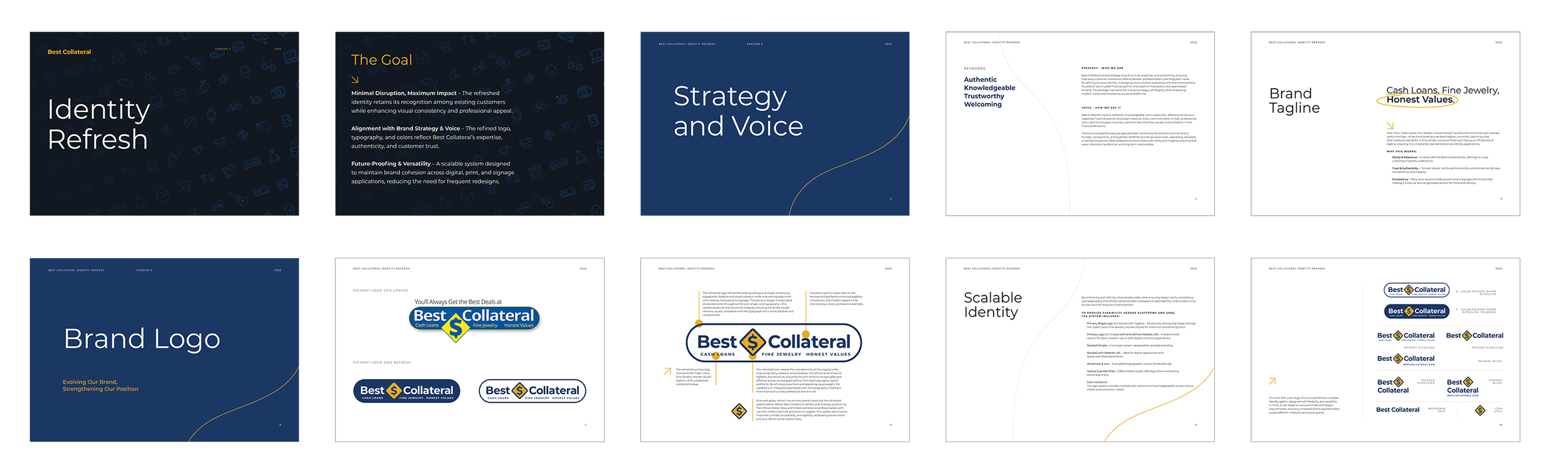
Overview
A comprehensive rebrand for a multi-location pawn and retail business with a rich history and a trusted customer base. Best Collateral needed a visual identity that honored its legacy while modernizing its presence across digital and print platforms.
Role
Senior Designer | Brand Strategist | Freelance Consultant
Scope of Work
Brand discovery and strategy
Logo refinement and typography update
Color palette development
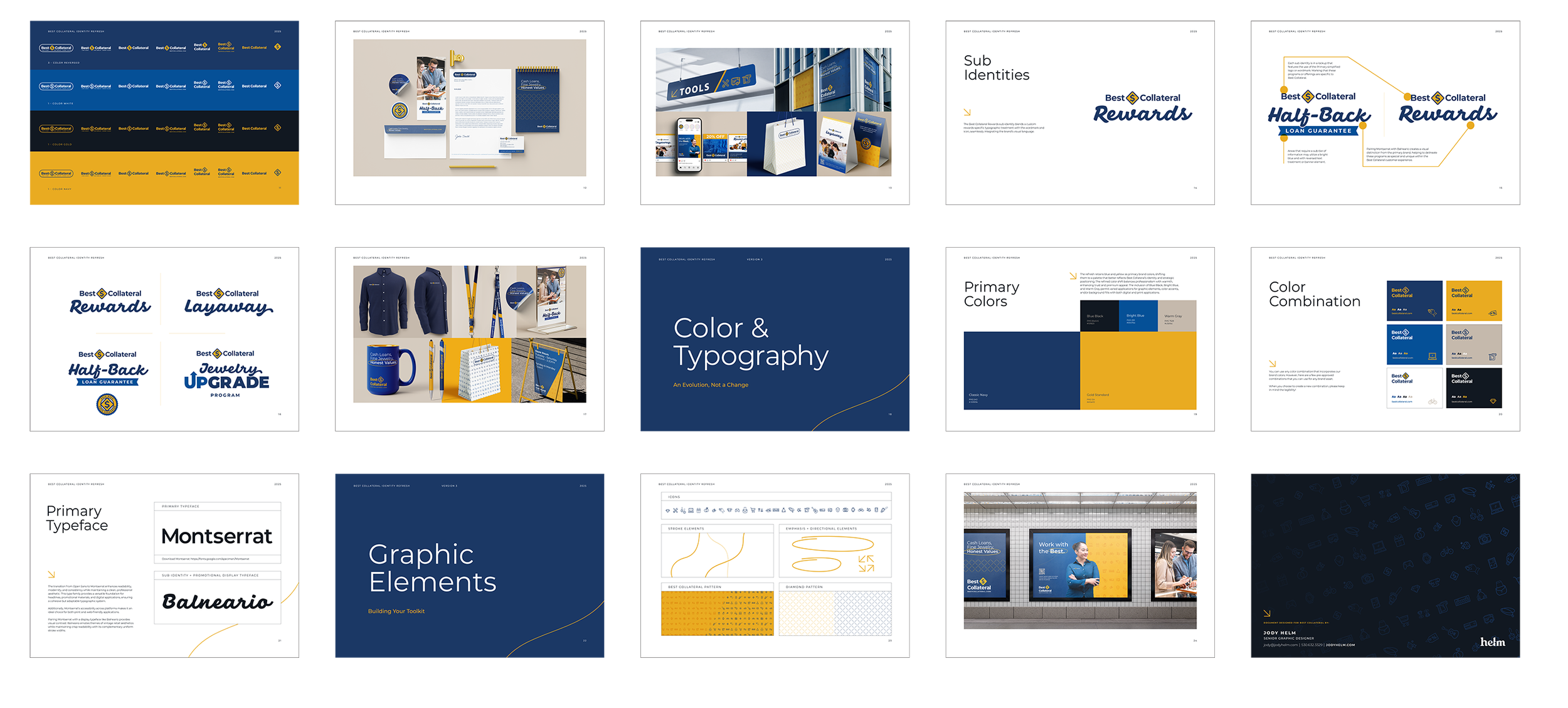
Visual identity system
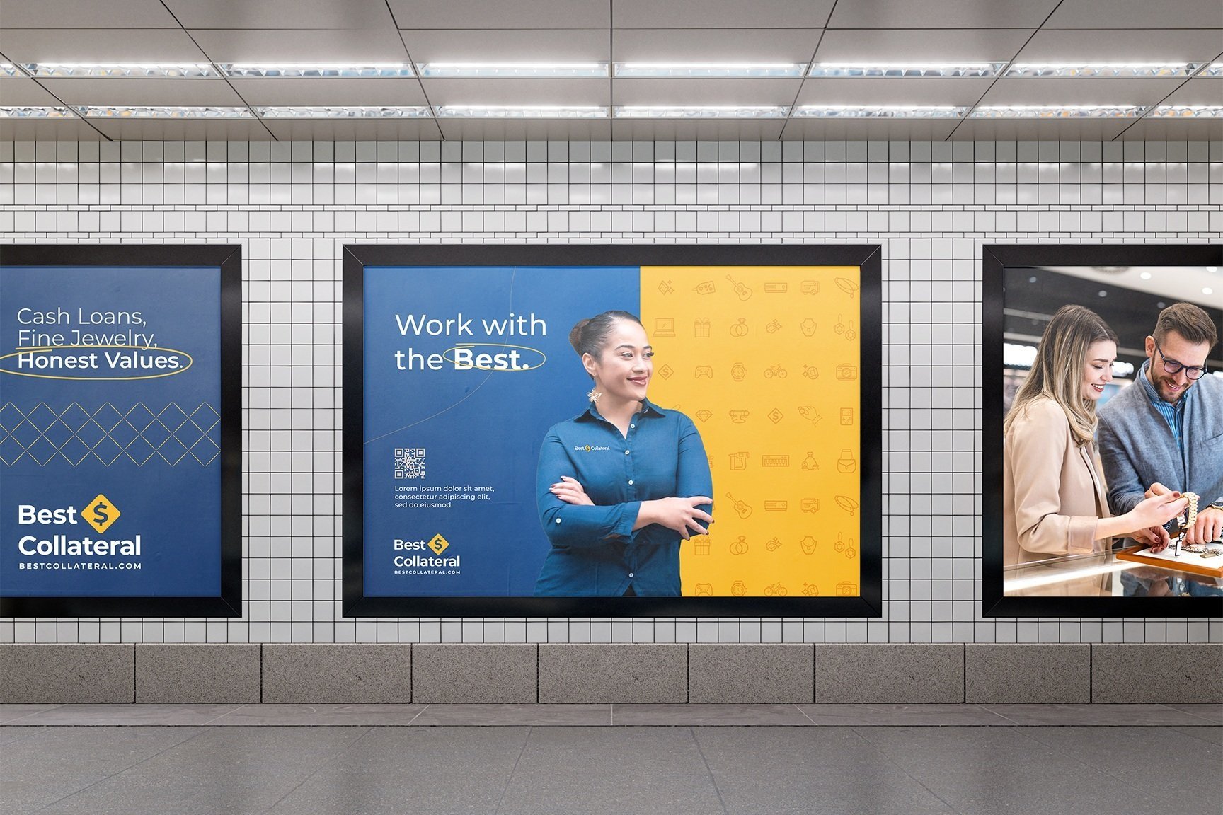
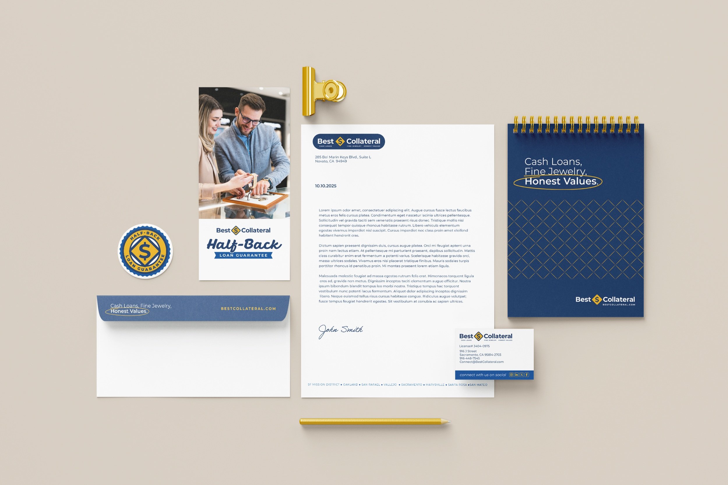
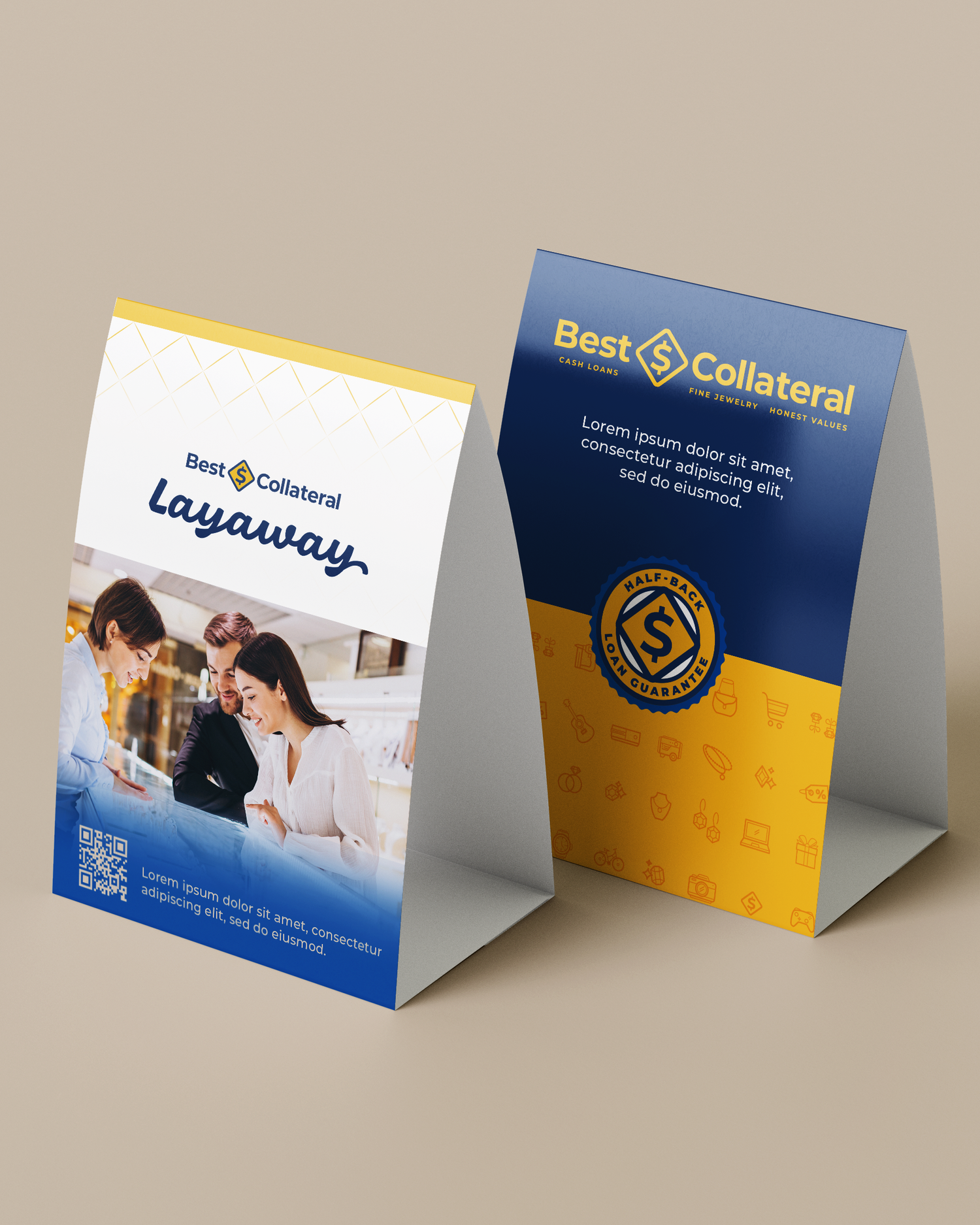
Digital and print asset design
Website mockups
Result
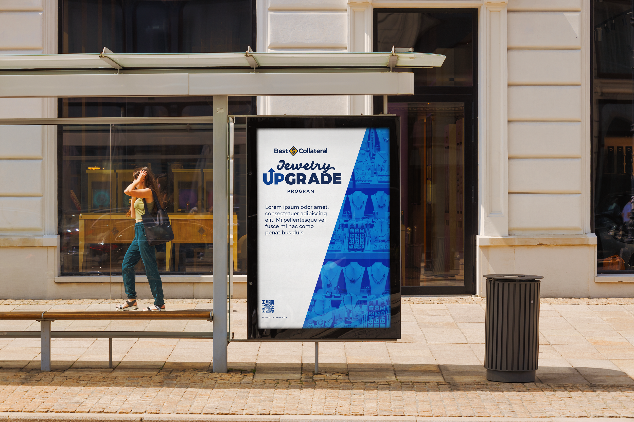
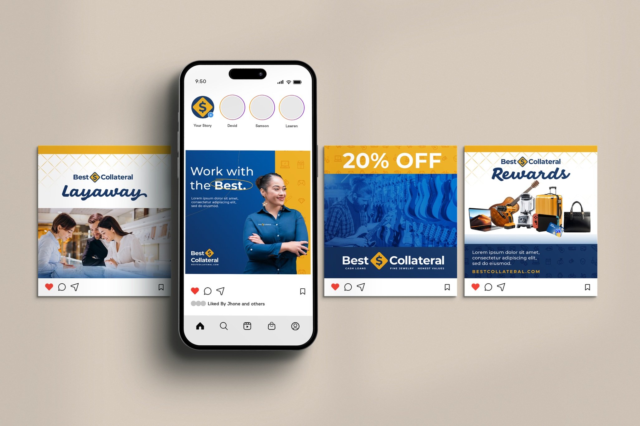
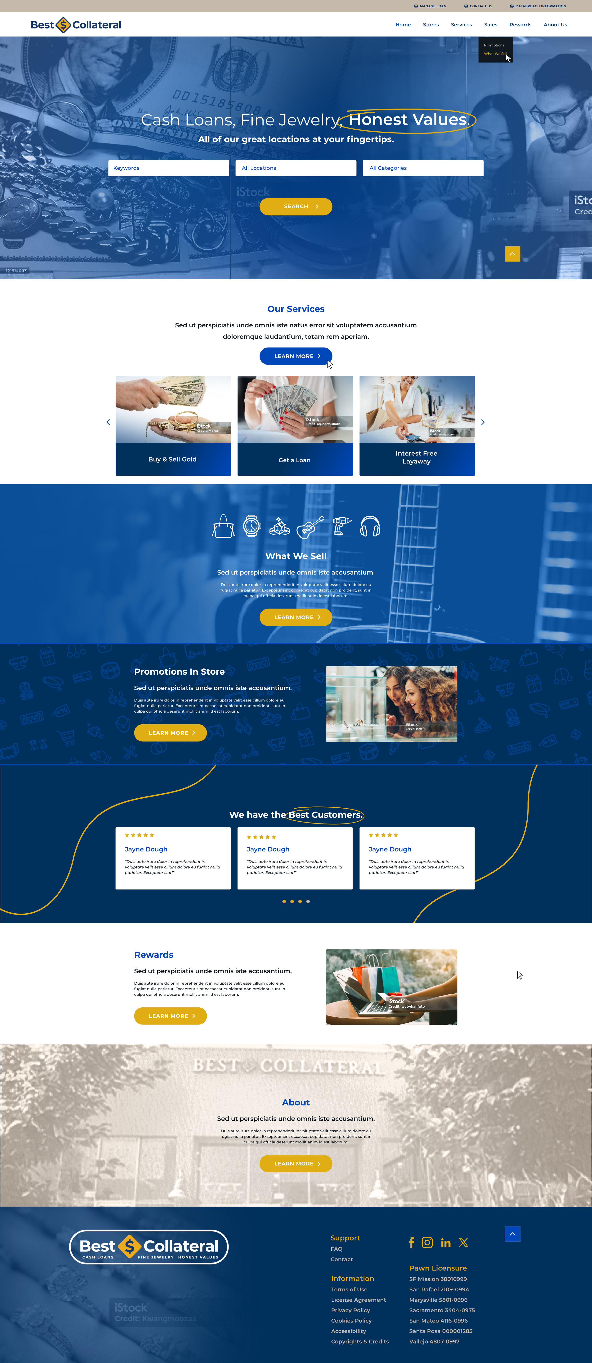
The final design system was created to bring consistency across the brand’s diverse environments—from storefront signage and printed collateral to digital campaigns and in-store displays. Each asset was developed with clarity, flexibility, and brand integrity in mind.
Approach
I began with a full audit of the brand’s visual presence across stores, ads, and digital assets. I then developed a brand refresh strategy that:
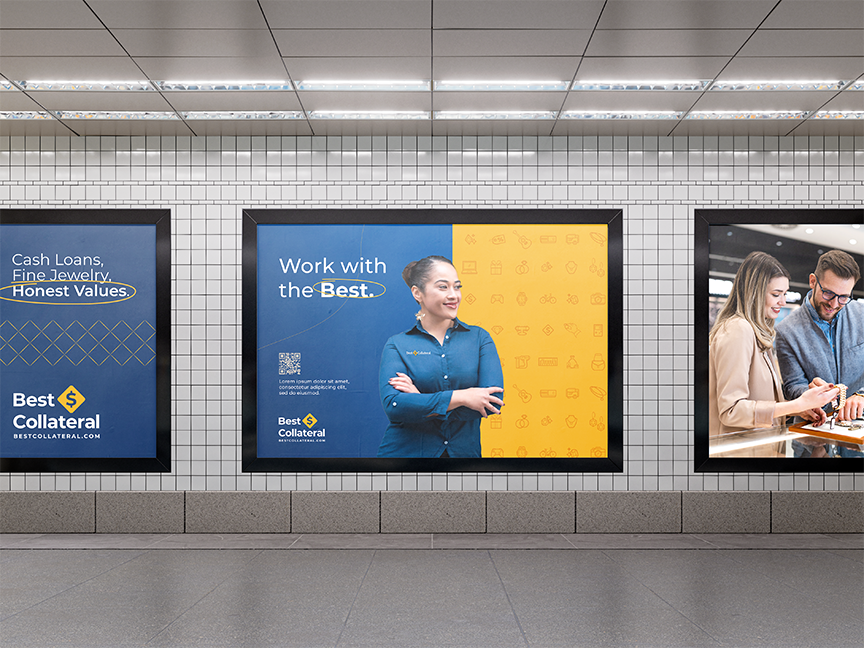
Evolved the color palette from a dated bright yellow to a sophisticated combination of deep navy, rich gold, and a warm gray—striking a balance between luxury and approachability, while better aligning with the brand’s value-driven identity.
Transitioned typography from Open Sans to Montserrat, enhancing legibility and lending a cleaner, more contemporary presence across all print and digital platforms.
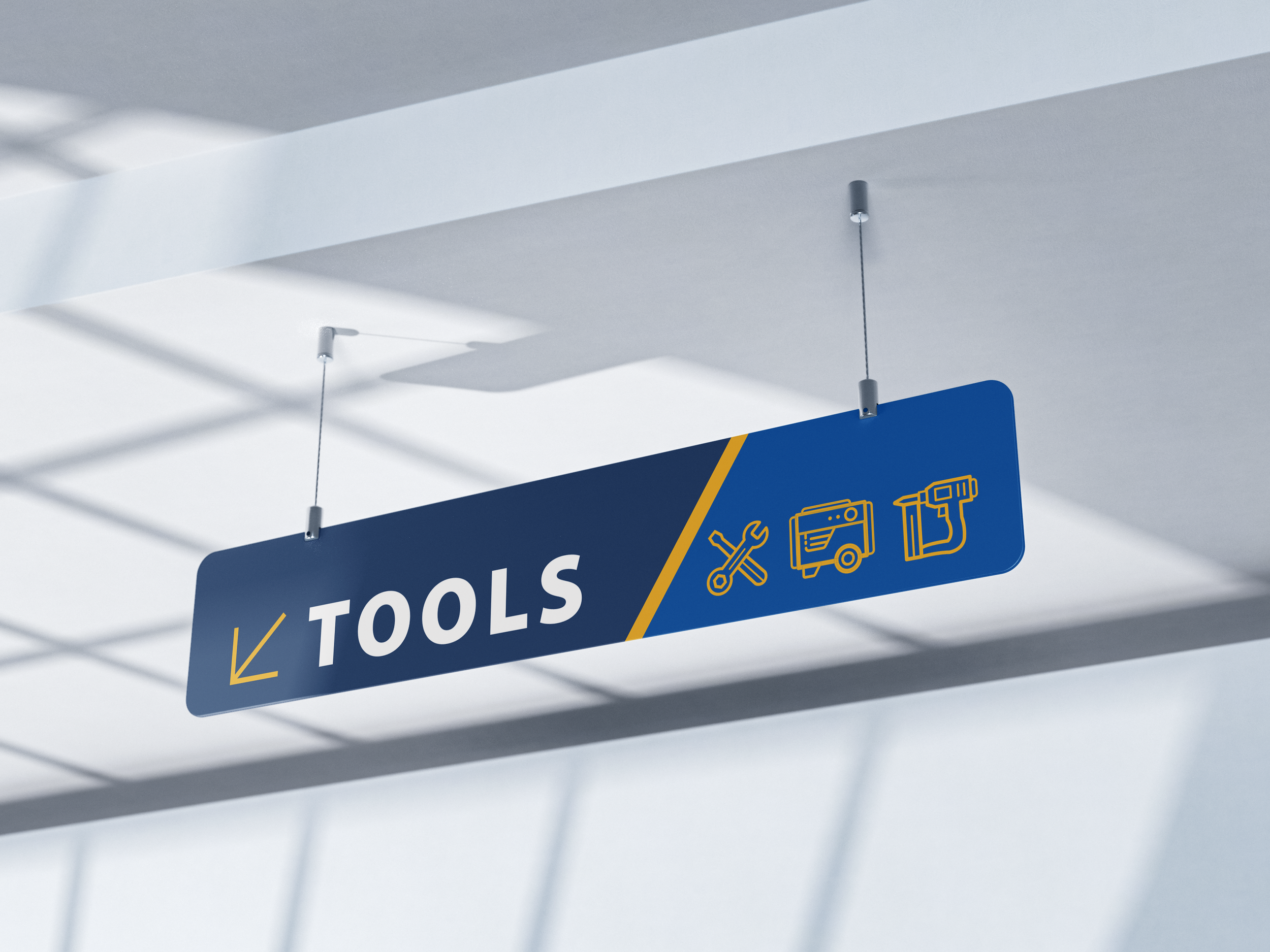
Developed a modular brand system that adapts seamlessly across signage, in-store displays, digital marketing, and social media—ensuring brand consistency while allowing location-level flexibility.
Designed implementation-ready usage examples and visual standards to support internal stakeholders, empowering future brand stewardship and cohesive execution.
Designed a versatile icon system spanning categories like retail, jewelry, pawn services, and store environments—created to unify in-store signage, digital content, and marketing collateral with a cohesive visual language tailored to the industry’s unique service offerings.
I worked closely with stakeholders to ensure alignment on vision, and I packaged final deliverables into a streamlined presentation to minimize revision rounds and support buy-in.


Reflection
This project exemplified the balance between retail strategy and design refinement. Working with Best Collateral gave me an opportunity to lead both the strategic and visual direction of a brand with deep roots, modernizing it without sacrificing the authenticity customers already trusted. It also allowed me to apply my print expertise while growing my digital design portfolio.
Tools Used
Illustrator, InDesign, Photoshop, Figma, Adobe Express, Adobe XD
Client
Best Collateral, California-based pawn and retail chain
Design Highlights
A new logo system with horizontal, vertical, and icon-only configurations
Elevated, flexible typography pairing Montserrat with an accent serif
Defined brand colors with HEX, CMYK, and Pantone references
Sample marketing assets including billboard mockups, social media posts, and POS signage
Website homepage and store location collage banner mockups using curated stock and branded visuals